In our daily lives we do not realize how color affects our decisions and purchases. How could it be otherwise, color in brands transmits emotions to us through the psychology of color. Many companies design their logos taking into account the sensations that colors transmit, since with them they send a message to consumers, they also help to transmit values associated with their brand. It is important that you take into account the psychology of color in the design of your brand, if you do not know what we are talking about, continue reading.
What is color psychology?
Color psychology is a field that studies and analyzes the behaviors and emotions that colors produce in people. There are many subjective aspects in this branch, so it is important to emphasize that there are different perceptions in the interpretation of the meaning depending on the cultures. For example, in Spain or Mexico black is used as a sign of mourning, while in countries like India or Japan they use white, depending on their culture one color or another is used.
Why is the psychology of color important in the design of our brand?
Through color we provoke sensations and emotions, making the consumer notice us or discard us. In addition, the chosen color can help us transmit the values of the brand, for example green is associated with sustainability, so that when used it sends a message to the consumer of a sustainable company.
Choosing the color of your brand well is important, it will give a lot of information about it and therefore attract consumers.
What does each color convey?
As we have already mentioned, each color causes different sensations and allows us to perceive some values or others:
Yellow
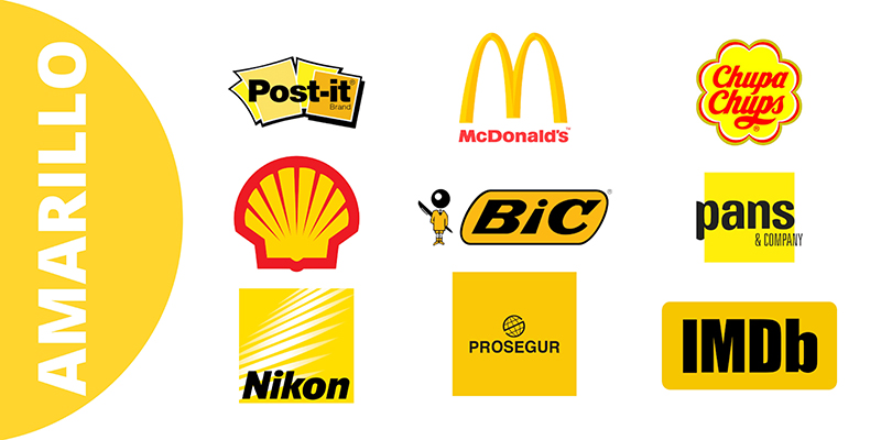
The color symbolizes happiness, intelligence, youth and optimism. It is linked to the sun and is perfect for attracting attention. It is a color that stands out to the human eye as it attracts attention, so it is used in design to help the user see what you want to point out. It is better not to abuse this color as it can cause eyestrain.
Despite being a color with positive connotations, this is not always the case. Many superstitious see it as a symbol of bad luck, in addition to being perceived as a warning or deception, it is an ambiguous color that should be used with care.
Blue
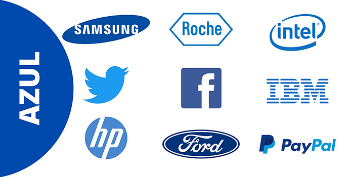
Blue is associated with the sea and the sky, so it conveys calm, harmony, confidence and security. It is the safe bet since it is the favorite color of a great majority. This color is linked to intelligence, which is why technology companies often use it. It is also associated with trust, which is why we find it in the health sector.
White
It represents the pure, the innocence, the truth. It is the color of perfection. It is usually used in the background since it gives amplitude. In logos, this color is usually associated with high-tech brands, since they are complicated sectors, they seek to communicate simplicity.
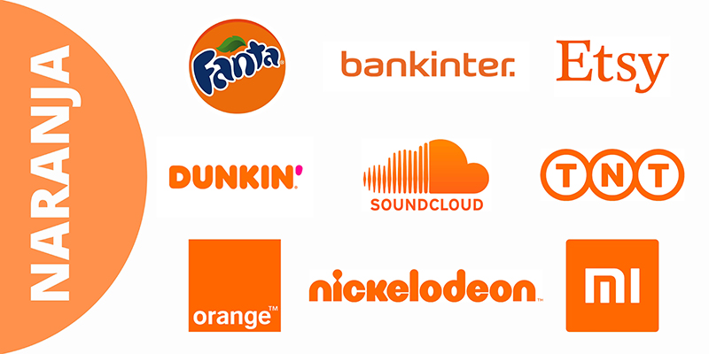
Orange
Creativity, quality and warmth. It is a very stimulating color as it is the combination of red and yellow, very vital colors. This color transmits heat, but without being aggressive like red, which is why it is usually used for calls to action, it does not overly saturate and is useful for highlighting information.
Color widely used in advertising as it helps stimulate purchases. It is also widely used in the food sector, it stimulates the appetite.
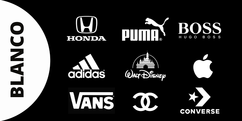
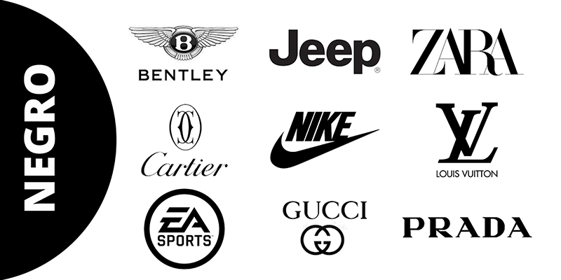
Black
Elegance, power and glamour, although on the other hand it is a color with negative connotations since we associate it with death and destruction. Companies that use this color transmit values of prestige and seriousness.
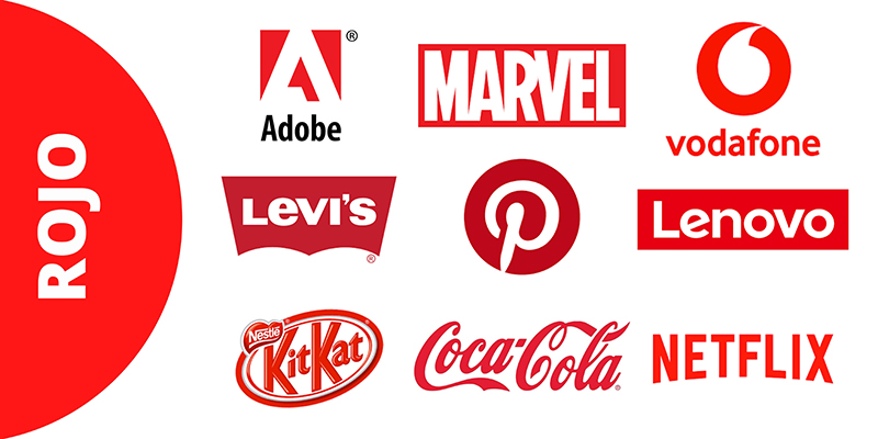
Red
It represents energy, it is the color of fire so it calls for strength. Very powerful color as it represents both love and hate. It is a color widely used in high-prestige brands, which are aimed at a high-class public due to its authoritarian connotation.
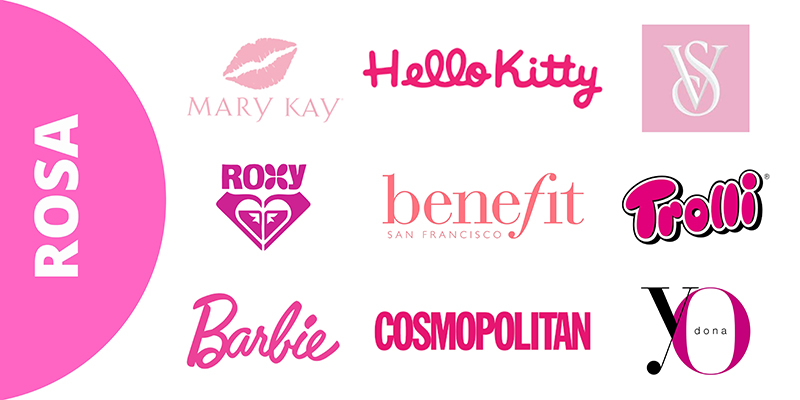
Pink
Warmth, sweetness and love, culturally it is a color associated with the feminine. Although it is a variant of red, it represents the opposite, unless we use more striking tones.
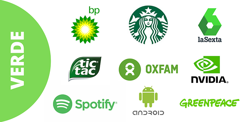
Green
Color associated with nature and related to ecology. However, green also means hope, money and peace. The color green is the opposite of red since it conveys security, the human eye sees it as something relaxing, many schools use tables of this color to relax children.
It is a color widely used in companies related to the environment or that are concerned about it.
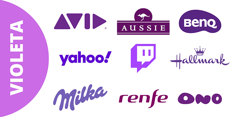
Violet
This color is associated with power and luxury, as well as wisdom and sophistication, depending on its hue it will represent one value or another. It is a color widely used in anti-aging products, since, as we have mentioned, it represents luxury.
Choosing the colors that will represent your company is very important and cannot be taken lightly. Using color psychology in your brand design can help you showcase your brand values and attract your target audience. Before creating a logo, think about what you want to convey and choose the colors that best represent them.